Puma Office
Location: Bangalore
Type: Office Space
Year: 2016
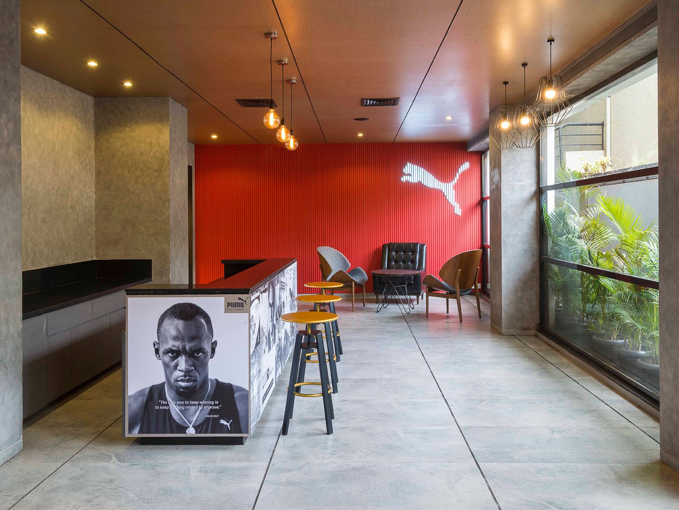
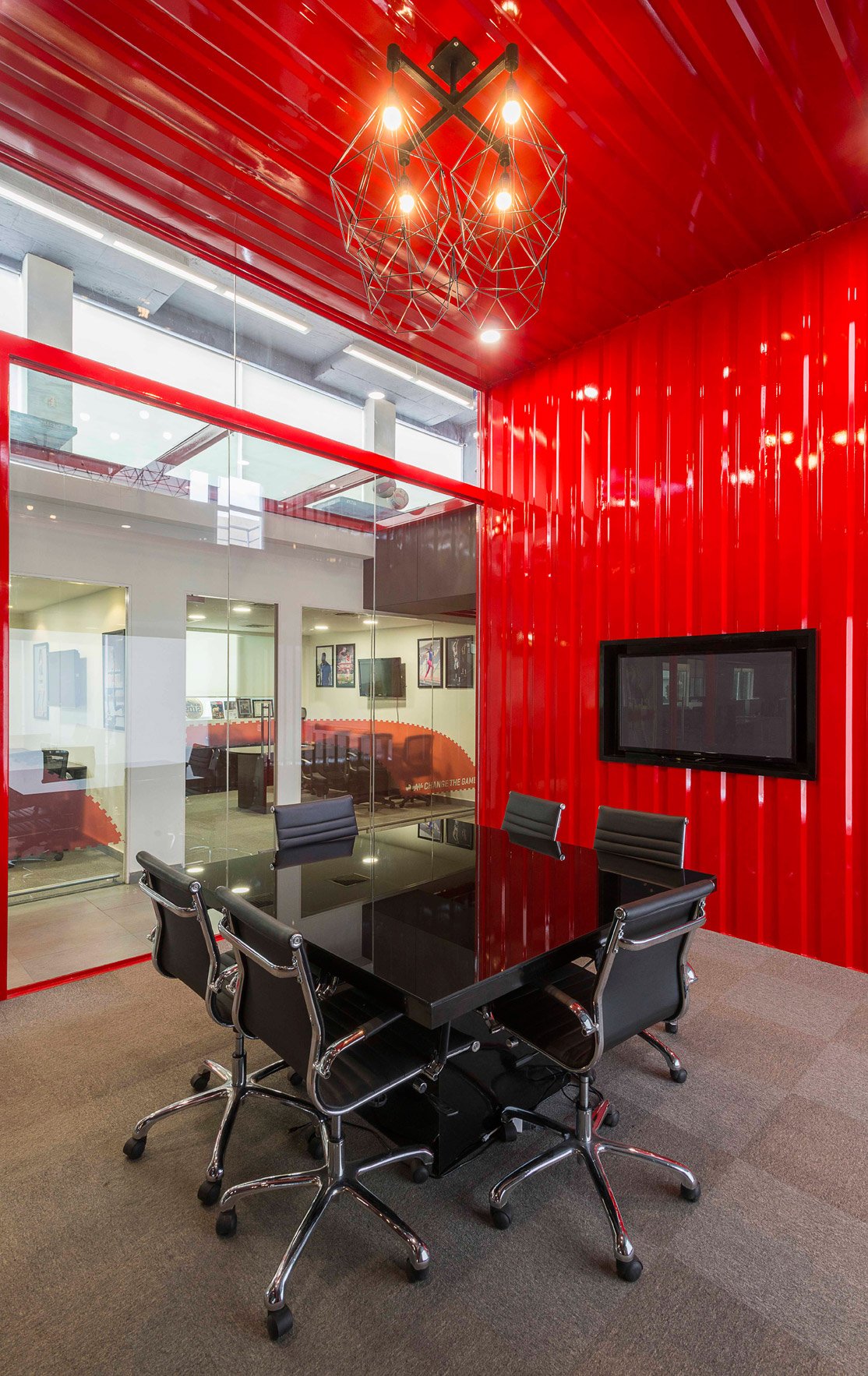
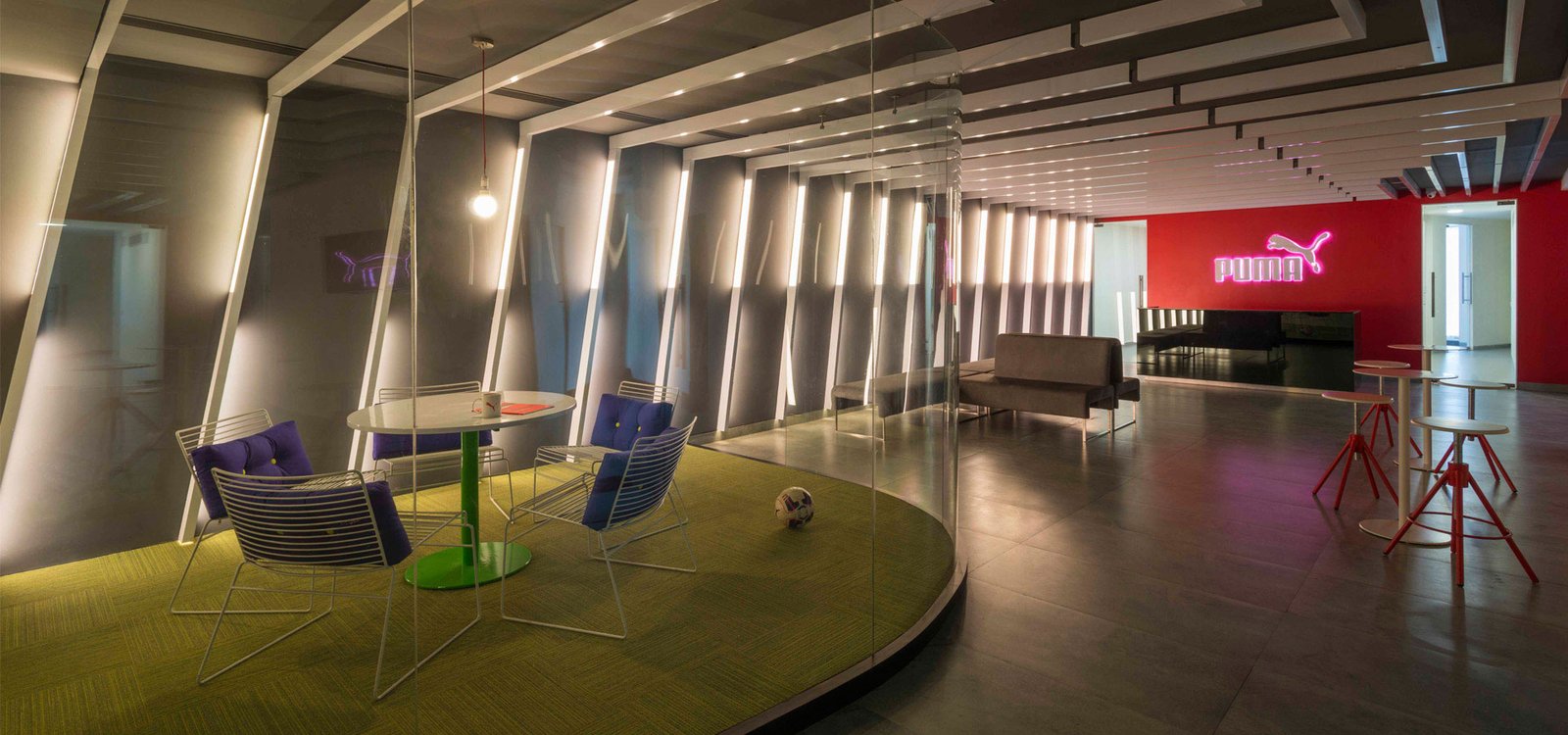
Puma wanted to renovate their existing office space, to accommodate their increasing strength of employees while giving it a fresh look. They were moving from being a lifestyle sports brand to a performance-centric one. And they wanted this philosophy to reflect in the design. Stealth & rhythmic movement is the core of this design. This is explored through repetition of travelling lines in a sequential manner and hexagonal lights as well.
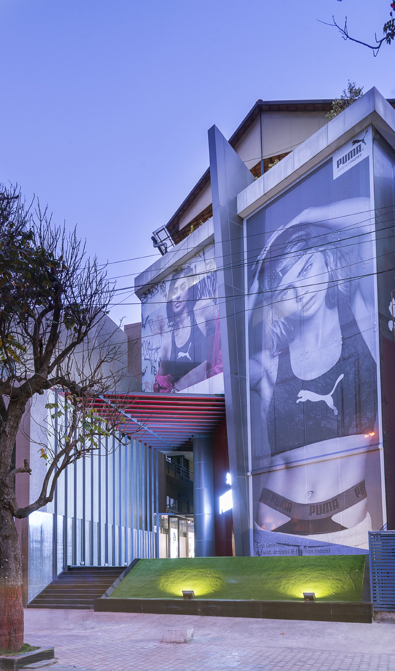
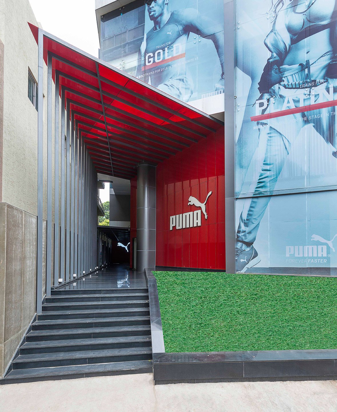
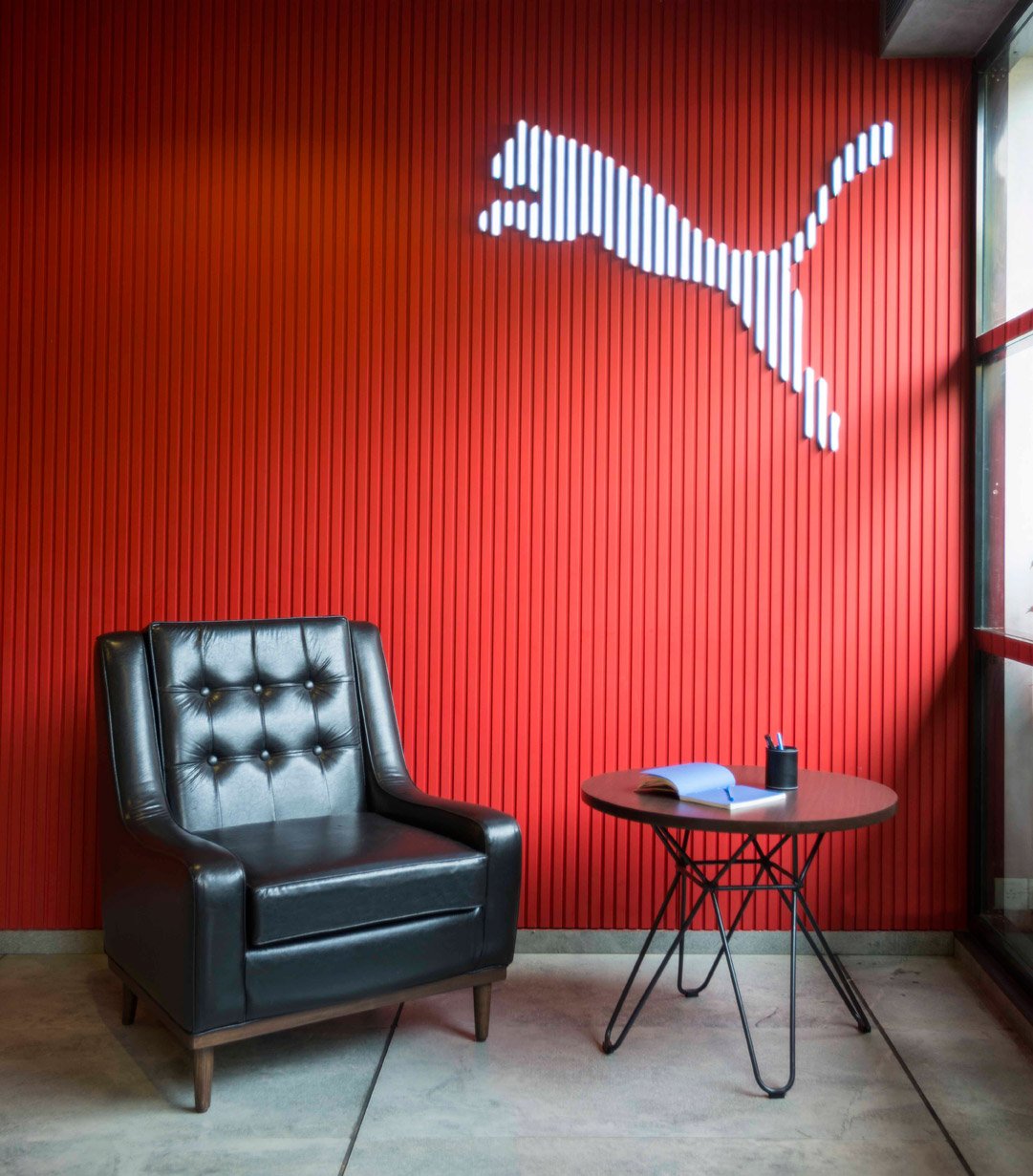
The brand colour red is used as glass panelling, with ribbed textures, old container metal sheets or a painted surface. Also, the use of transparent walls and open planning, help in maintaining a clear and interactive environment. This effectively contrasts other neutral elements like the monochrome palette flooring, walls & ceiling. Lastly, the building façade has a metal entrance portal that progressively reduces in size, set against a large, still, red glass surface with the signage.
Photography: Anand Jaju

